
I was recently approached to create a visual identity for a new makeup brand preparing to enter the crowded and fast-paced beauty market. With a clean slate and an ambitious vision, the client wanted a logo that felt modern, elevated, and fashion-forward—something that would resonate with their target audience while standing out on shelves and in digital spaces.
To kick off the process, I explored a wide range of logo directions, each rooted in a slightly different aesthetic strategy—from bold and architectural wordmarks to delicate, serif-based logotypes with refined flourishes. The goal was to showcase how the brand could flex across various moods and personalities while maintaining a strong, cohesive identity.
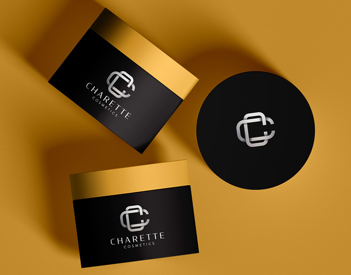
To help the client envision how each design could live in the real world, I mocked up several packaging variations—lipstick tubes, compacts, and skincare bottles—applying the logos to sleek, minimal layouts and more expressive, editorial-style treatments. These mockups allowed the brand’s personality to come to life and demonstrated the power of thoughtful typography, spacing, and proportion in a physical context.
As part of my approach, I also considered production techniques that could elevate the final brand experience. I envisioned many of these concepts incorporating premium finishes such as spot varnishes, embossing, or reflective foils—details that can make a significant difference in the tactile and visual impression of a product. These elements not only signal luxury but also create moments of delight and discovery, encouraging customers to connect with the brand in a more sensory way.
While the final logo selection is still in progress, I believe several of the directions explored here have the potential to evolve into a standout brand identity. For a beauty label that wants to turn heads and establish itself as a serious player from day one, these early explorations offer a strong creative foundation—and a glimpse of what’s possible when strategy, design, and storytelling come together.


